Blogs that suck time

my pooTUBE
my pUtube
my poopics

SWOBO
avoid the bummerlife

need to reach me? pedalhome at hotmail

Friday, January 11, 2008

it's how i roll ...

And so ... late, as always.
-

This here blog is kaput ~ and thanks for the times. I'd hoped to post something poetic ... meaningly hallmark'ing the occassion. But, the winds already blew away that sand painting.

if you catch my drift.
-

Next Toy ~

If you want to read what i'm dinking with now, it's at norcalcyclingnews.com. The site will be just as it sounds ... whatevah.

i know ... ridicule.

Anyway, there'll be more graphics and widgets and RSSfeeds and blogrolls. It'll be chock full of almost-fresh content, and bad grammar, and and spammy hernandomediacroticraticdialectimadness in hopes of stealing you away from concentration ~ and maybe pissing away some of your time at work, or occasionally flaming it up with agro-anonymous comments.

anyway ...
-

2007 ... Year in Review

Best Team: PROMAN
It's a woman director of a UCI Trade Team. Hello? But overall, this team competed in every discipline of the bike in '07 ... and actually didn't get burned the FRACK out and wants to get even bigger next year.

Kudos to Nikki Cranmer and her ability to gather up great riders, great support, and hot looking kits.
-

Best Rider: Andy Jacques-Maynes
the dude broke bones, impaled tissues, destroyed traffic furniture.

he's like, bionic.


Coming back from TWO surgeries to repair his brokenocity ...

Coming back in a matter of WEEKS to nab a National Age Title and a 6th mutha-fukkin Place at Natz in the Elites.

there is no comparison.
-

Best Woman: Shelley Olds
unbelievable strides made by this young rider.

track, cross, road ... destroyer.


She fulfilled obligations to Anthony over at CalGiant Strawberries by hitting the big-name Cross races this year ... even while chasing the Olympic Track Dream to Beijing.

Everyone who watches this woman race ... enjoys it. She's smart, beautiful, can flip you off without a shrug, and rides her bike like it's the last thing left in the universe.

easy call.
-

Best Man: Ben Jacques-Maynes
This guy is faster in '08 than last year.

"Hello Tour of California, my name is JERSEY WEARER!"


Even the boytoys at VelosNooze were cool enough to name this guy America's Road Cyclist of the Year.

hell yes, he is.
-

Best Race:
Kern County Women's Stage Race ~ 35+

Wonderful battle between two big women's teams and a bunch of sparky individuals. I drove behind the stages as wheel support and had my heartrate higher than most of my crits last year.

Beautiful to watch and a race I'll go to for as long as it's held.


and I make no bones about saying ... Sabine winning that road race stage that ended on a grueling 2 mile climb ... made me so proud i about cried.

It wasn't that it was a win ... it was that their entire Velo Bella team worked in pro-level tactics, kept smiling every stage (even though they were all so bloody hard), and rode for each other ... full gas.

that is the best.
-

Best NorCal Prosey ~
Jared Barrilleux ... hands down.

This guy foamed at more races than o'Grady. He attacked when he didn't have to, when it was right to, when the crowds asked him to.

he's a true warrior on the bike ... just flinging himself at pain and danger.

my kind of guy. And, he signed up PRO for '08 ... so, right on, right on.
-

Best Time ~

today.
-

Thanks again for taking part in this little experiment. I'm going to have my next project up fairly soon (http://norcalcyclingnews.com/). Whether that will be worth a crap is yet to see.

but, graffiti just is, anyway ...


lates,
~michael

Tuesday, January 01, 2008

thank you, Mystery Bloggers

after i recover from bradley dropping my ass like a bad acid trip ...

i'll toss out a final post.
-

in the meantime, a couple of pics de SanBruno (
mas on the way) ~


it's way up there ...


and steep in some spots ...


and DFL-Squeezes sometimes pass you


and drop you at the finish ...


but, that's ok ... cuz it's beautiful


even if some bastiches taunt you like there's no tomorrow


and roadie scum show up to drop bombs on your booty
-
Good times.

Monday, December 31, 2007

You pussy!

Alright, now that I've got your attention, let's talk about making realistic New Year's resolutions. You and I both know you aren't going to loose weight, ride more, watch less TV, eat more veggies, sleep more, sleep less, donate to charity, talk to your kids, etc. so don't set yourself up for failure by telling yourself that maybe this time it will be different.
It won't be.

But, there are some resolutions that are attainable. You can resolve to eat 2 servings of veggies a month, to watch no more than 10 hours of TV a day, to spend no more than 6 hours a day mindlessly surfing the interweb, to wash your bedsheets every 6 months, to shower at least once a month, brush your teeth once a week, call your parents once every two months or when you need $ or whichever comes first, etc. These are resolutions that are within your grasp.

Furthermore, if you are going to be spending a considerable percentage of your waking hours watching TV and/or surfing the interweb, you can also resolve to develop your vocabulary. In this spirit, I have taken the time to compile a list of words and phrases that I have collected in this past year. You may already be familiar with some of the following terms but treat this list not as a comprehensive, be all and end all list, but rather as a skeleton list with which to start your New Year off on.


ass hatchet
noun
Type of saddle that is particularly uncomfortable
see also 'beaver cleaver'

beaver cleaver
noun
Generally refers to a type of women's saddle that is particularly uncomfortable
see also 'ass hatchet'

BRIDE
acronym
Bicycle Racing Induced Disordered Eating, a disorder in which very restrictive eating habits and patterns are adopted in the name of bicycle racing. Believe it or not there is a difference between eating healthy and disordered eating.
Ex. Bob's got a horrible case of BRIDE. He'll only eat raw food that is vegan, wheat-free, shade grown, certified organic, fair trade, locally grown, and unprocessed. I think he can only eat at home, surrounded by his measuring cups and his gram scale, or at Cafe Gratitude.

brodeo
noun
Any gathering that is predominately male
See also 'sausage fest'

bromance
noun
An unusually strong attachment between two (supposedly) hetero men

carbon fibre
noun
type of material that is used in the construction of bicycles. Tomorrow's carbon fibre is significantly more laterally stiff, vertically compliant, and lighter than the carbon fiber of yesterday

duditude
Noun
Manner, disposition, or body posture that is aggressively and obnoxiously dudely

'frisco
Noun
Preferred abbreviation of San Francisco

fanny pack
noun
Bag that is worn around the waist. No, it is not called a hip pack, you fucking hipster turd nug, it's a fanny pack and if you don't have the cajones to call it what it is because it makes you think of a sweaty, bovine, balding midwestern man at the county fair then don't fucking wear one you pansy
Syn. man-purse
Ex. If Jackie Phelan rides with a fanny pack, there must be something to it!

fast
adjective
Describes a rider that is capable of dropping 90% of the population. Sometimes euphemistically used as a synonym for a BRIDEitis or 'rexie rider.

fixte
noun
Colloquial term for a fixed gear bicycle that originated in Novato
Syn. fixie

flesh fest
noun
Competitive event wherein competitors have to swim, bicycle, and run
syn. triathlon

"I used to be a runner"/"I ran in college/high school/etc."
idiom
Rider who is in the process of transitioning from cyclist to triathlete
Syn.'future triathlete'

laughing group
noun
Group of racers that compete for the title of "Lantern Rouge"

manscape
noun
a view or scene in which the predominate subject is a particularly attractive man or group of men
Ex. Say what you will about the evils of SlowCal; the manscapes of SlowCal are generally of higher quality then the manscapes of NorCal.

mantathalon
noun
Semi-competitive event that features several different masculine tasks. Often includes ball scratching, belching, beer guzzling, farting, etc.

Muppets
noun
Cult of athletes who are working collectively and successfully to dominate, destroy, and conquer every event that they enter. They should be considered armed and dangerous.

road bacon
noun
Colloquial term for the abrasions and injuries that a rider sustains when they crash
syn. road rash
related forms: bacon

sausage fest
noun
Any gathering that is predominately male
see also 'brodeo'
related forms: saus fest, SF

singlespeeder
noun
Describes a cyclist who rides a bike with one gear
Syn. Alcoholic, Stoner

SlowCal
noun
Abbreviation of Southern California
related form: SoCal

strong
adjective
Physically able to produce a large amount of power. Sometimes euphemistically used as a synonym for fat, sturdy, etc. when describing other riders.
Ex. Penelope sure is strong but she can't climb to save her life.

testacular
adjective
an event that is generally masculine in character (e.g. a pissing contest)
syn. mantastic

totes
abbreviation of totally
Ex. "Want to stop and get some coffee at Peets?" "Totes."

trots
noun
Exercise induced disorder that is characterized by the increased need to visit the bathroom

winter weight
noun
Weight that is gained at the end of the road racing season. Varies from 5 to 20lbs and is more common in the northern, colder latitudes. Provides additional cushion for 'cross racing.

wife pleaser
noun
Politically correct term for a white, sleeveless undershirt
syn. muscle shirt

WLB
acronym
Whiny Little Bitch, seen almost exclusively by the side of the road futzting with their saddle height, their cleat position, and/or their handlebars. Also found in bike shops on sunny weekend afternoons vocally describing their innumerable neurotic issues

I hope that this list serves you well and that you all have a happy new year.
Love and other stuff,
Ms. B. Hayven

a worth cause in 2008

The organization, Cycles of Change, is located in Oakland and greater Alameda County. They work at after school programs doing youth development work in low-income communities. Projects that Cycles does include: earn-a-bike program; after school classes teaching bike mechanics, maintenance, and repair; organized group bike rides; and they have just begun a school garden program.

The program is in need of any old, used bike parts-- particularly mountain bike parts (as that is what the youth ride, middle school aged.) They also accept monetary donations.

There is further information about their programs and donations on their website.

If you have parts that you would like to donate you can give them to me (beth) at any time I see you this year and I will be happy to cart them to the East Bay if you don't live close to one of their drop-off points.

Happy New Year all! And thank you for letting me use this blog for this shameless plug.

What Hunicutt Said To Hawkeye


See ya later, Olaf. Time to go back and dream it up all over again.

cgb

what a lovely mess

I thought I was done blogging but someone annoyed me, and I’m in the mood for employing the one strategy to combat idiots other than just plain ignoring them. I’m going to try employing some reason. Boring! I know, I’m thinking again. Damnit.

Any old boy can stand in the middle of the street and shout and call it “expressing himself.” I’m expressing myself, I’m expressing myself, look at me! Now bending down to the ear of your friend and speaking in a clear voice and careful tone, that’s the impetus towards communication. Not to mention art, which is tuning intonation and structuring style to manifest a vision, with the ultimate aim of allowing the vision to speak for itself. The reason I’m mentioning all this is because it is important to recognize the difference between expression and communication, and the difference between criticism and intolerance. There should be an ethics of communication we refer to in order to mitigate the destructiveness of those who disregard reasoned criticism in favor of emotional rants.

Intolerance has its applications. What we should be intolerant of are attack dog sociopaths whose one goal is to gain the illusion of a few rungs advantage by bringing others down to their level. Their goal is to feel good about themselves. The problem is the means they choose to do it. It is unfortunate that there are so many examples of unreasoned attacks in the public discourse by supposed public intellectuals, for example O’Reilly, Limbaugh, Beck, Dobbs. The attack dog sociopaths criticize based on emotion, not merit, and make people afraid to believe in things by swinging fear, tapping into prejudices, and relishing in the joy of unleashed ego and squawking omnipotence. What it really is: an act to hide basic incompetence. Problem is this advantage comes from constantly talking, and dissipates when listening. Thus they talk a lot. They’re the loud ones. Unregulated arrogance. It is unpleasant to hear.

Criticism, as opposed to unreasoned dismissiveness, is a healthy thing and helps the cream of the crop surface in the marketplace of ideas. It is one of the strengths of our country. It is what the system of peer review is based on in the sciences. Theories, opinions and suppositions are supposed to be challenged to find any weaknesses, mal assumptions, or things that were overlooked. Criticism and reasoned argument can be the great strength of a blogging community, the means by which people learn things by connecting on the internet.

The difficulty is there are plenty of dismissive sociopaths trolling for prey on the internet as an outlet for their shouts and rants, their bursts of hurtful expression. An ethic of conduct to guide interactive forums on the internet would be a good addition to any blog. Anonymous sociopaths could be redirected to the code of ethics when they decide to chime in. I mean, lay the rules of conduct down to steer fruitful public discourse, so we can rest on our civilized laurels and don’t have to waste energy counteracting each new episode of mean spiritedness. You can also lay reasoned arguments next to the sociopath’s rant so that those on the fence of the continuum of expression-communication can have a clear choice to make. They can see the difference. Will they give in to their frustrations and lay down with mr. angry, or will they pick up their wand and try to fine tune it, choosing to believe we live in a progressive society? So you can lay down a reasoned argument to counteract the dangers of a rant (dangers being 1. it will find sympathy 2. it will discourage reasoned discourse by creating an emotional turbulence of fear and dislocation), but in the end, remember the limitations caused by the sociopath’s disregard for reason. From Jonathan Swift: “It is useless to attempt to reason a man out of a thing he was never reasoned into.”

I met an old friend of oV’s and we talked about oV’s blog, and this old friend said, “yeah, what a mess it is.” I said, yeah, but what a LOVELY mess. Most of the time that’s the way I feel.

Thanks for the mystery posts all. I am grateful for getting to post with you. Good luck in all your endeavors, peaceful warriors. Happy New Year, ~~lg

Romeo Is Bleeding


cgb

When Nobody Knows Your Name

They made no attempt to reenlist me. My four-year service ended after three years and 325 days.
Of the six or seven visits I made to the hospital in Germany, at least four were for bike injuries. Once I pulled my achilles pretty bad in a crash and couldn't walk uphill; a terrible thing on a hillside base.
Montana was a chaotic mess. The order of the service was replaced by terribly stupid hippies whose one talent in life was to make fun of smart people who liked to think and talk about things.
Solace was found in the selective cultivation, dessication, incineration and inhalation of various strains of a pernicious plant.
A philosophy was formed, leading to an ideology that remains, albeit personal and considerably impolite to pass on with any kind of impassioned voice, lest those terribly stupid hippies come back for their Dead tapes.
Some lessons were learned more selectively, and in parts of a forest primeval where other voices reign much more supreme. A hall of spirits who showed the river of emotion through which we all flow our lives. An antidote.
It lasts forever, this knowledge, but it is hard to share. Many only know the euphoria; the transcendence leaves them queasy. Their untwinned tonal/nagual spirits are unable to join and they only see the road in front of them.
Cynicism is easy. All you have to do is pull the trigger.

cgb

Yuri Chervochkin

They followed him home.

He called his buddies to say it was the same four cops who had been harassing him for about a month or so.

He was an activist. He wanted to take part in something, to change his world.

Right or wrong, he wanted to put his voice into the larger chorus of the world, to be heard.

He wanted to exercise his rights.

Instead the neighbour found him in the street near the brick home he shared with his mother, his head caved in.

Doctors later said it was the work of baseball bats, and that at least two blows were landed with such precision as to act as kill-shots.

He would have turned 23 today.


cgb

Who Wants To Go To Rugby?


"The owner of such an expensive machine is apt to be fussy."


cgb

No, New York is where I'd rather stay

Almost a pound of meatloaf with a porcini mushroom demi-glaze, an equal amount of garlic mashed potatoes and boiled carrots sautéed in butter and brown sugar. That’s an undisciplined bike racer’s off-season lunch and the nadir of a months-long devolution.

Maintaining fitness gained through the racing season was going so well, in September. The sun was out. The local group rides were still going strong. I had the stamina to take reckless flyers off the front of the pack. The dream of being competitive in road races during the 2008 season was alive and well.

The fitness slide started in October. I have some crazy teammates – or from another perspective, dedicated teammates – whose idea of a fun weekend ride is four hours long with 7000 feet of climbing. They got off their bikes looking like they could go another four hours. I barely had enough strength left to push down on the gas pedal so I could get home and take a nap. Those guys are road racers. My dream had died. Fifty minute crits, here I come again.

By mid-November I was hemorrhaging fitness. Just maintaining enough of a base for early season crits was becoming questionable. I was at the crossroads. One direction required discipline. The other only needed a rationalization that come January I can train really well and get it all back. My high school football coach once screamed at me, “I got more damn discipline in my little finger than you have in your whole body.” Truer words were never hollered.

In December… well I suppose I’ve painted enough of a picture.

I’ve really grown as a person this off-season -- I mean beside the extra inch around the waistline. Since college it's seemed to me that by middle age a man should have acquired the skill to superbly mix at least one cocktail. After years of testing I think this off-season marks the year that I can finally say I'm an expert at pouring that grandpa cocktail, The Manhattan. Blend two ounces of whiskey, a capful each of sweet and dry vermouth and three dashes of bitters (I skip the fruit, but a cherry or a lemon twist work nicely).

If my football coach could only see me now. I'm pretty sure he'd cite his little fingernail rather than his entire little finger.

Crash and Burn, Return


Why is it that most spam email reads like the lyrics to an REM song?

"surface. bomb to bring down a U.S. airplane. According to the part in discussions. In addition to this the potential

It was a mistake-filled game for both teams, with producers. The government funded service is formally equal protection, and, as Heaven does its rains, shower"

cgb

Thank You, Simone

Al Qaeda released its latest video message this week, with leader Osama bin Laden laying out his year-end thoughts, as well as a top-10 list of films he saw in his cave in 2007.

“Of course the infidels are measuring out their tyrannical bile in equal doses to the oppressed people’s of the Earth. Little Bush and his illegally-elected cabal of Zionist-infiltrated murderers are responsible for a genocide against Islam; they are trying to pursue an unholy crusade for the materiel wealth under the sands of the holy lands. Nowhere in their history of torture and fascism is this more evident than in the substantially perverse education they impose upon their children.”


“#7 Ferris Bueller’s Day Off
Young Ferris Bueller’s quest for freedom, however misbegotten in an infidel society, is a holy voyage to liberate himself and the world around him. To shake off the tyrannical bonds of a false god, to free his friends and peers, to expose the worship of material wealth in his society as an irreligious waste of time and heart.”

cgb

Men Who Look Like Old Lesbians


Brian Setzer. Singer. Songwriter. Guitarist. Band leader. Teaches women's self defense at Hayward, CA, YWCA.


cgb

De Nuevo Empezar, Un Nuevo Viaje


cgb

Sunday, December 30, 2007

to anonymous, from anonymous

What I am about to say is for the benefit of all blogkind.

First and foremost I would like to say publicly to every mystery blogger who has dedicated the theme of their post to "Hail to King Vanderhoot" (i.e. "Hernando is the mostest bestest blogger EVER and where will the world be without him and no one can compare and he is a legend and all you sniveling imitators will never amount to the wonderfuleriffic-ittude of the Great And Powerful Olaf"):

BARF.

SPARE ME.

GET A FRIGGIN' HOLD OF YOURSELF, YOU PUSSY!


Whew. Now that I got that out of the way, I can get to the real meat and juice of this little ditty, which is this: ANONYMOUS BLOG COMMENTERS ARE ASSHOLES.

Or, some of them are. Namely, the ones who like to leave "constructive criticism" in the way of phrases such as "You're a fucking dumbass!" and "Get a life, you fucktard!"

Hmph.

Don't get me wrong, I can shit-talk with the best of them, but one just has to wonder: WHAT IS WRONG WITH YOU PEOPLE?!?!?! If you're so fine-freaking-tastic, then write a post of your own. And if you're going to be an arrogant jerk, you could at least identify yourself before doing so.

So anyway, for those bloggers who are less adept at responding to the loving words of their anonymous commenters, I have included below a fail-proof recipe for creating insulting phrases that one can use against your bloggery foes.

STEP 1: Select a kitchen appliance of your choice (sharp objects such as lemon zesters, cheese graters, and food processor blades work nicely for a start)

STEP 2: Choose an orfice of your opponent's body

STEP 3: Tell the anonymous commenter to shove the kitchen appliance up their bodily orfice.

And wha-la!

HOT or NOT: team kit year in review

As 2007 will quickly be closing, it is a perfect time to do the 2007 team kit year in review: HOT or NOT.

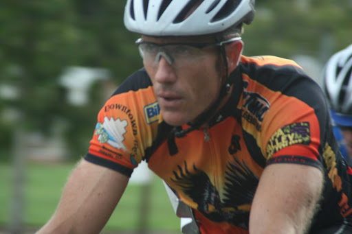
Cycling clothing is inherently awkward: shorts with built in suspenders, pockets in the back of shirts that get stuffed and bulge out all weird, and zippers down the front on a shirt that has a stand-up collar. Team kit designers are not only challenged by the aforementioned design and material of cycling clothes, but then they must somehow put together a bunch of disperring corporate logos and slap them on strange places like shoulders, hip bones, tail bones, etc. These logos often have different colors, styles, and font types. Thus, putting these all together in an entire assembly that matches and looks pleasant is difficult to boot. On top of the difficult of sponsorship placement & matching, kit designers must make these all fit into a nice color scheme and design. On top of that, cyclists have differing body types, and making a kit that is flattering on both the climber and sprinter is another challenge.

While these are all challenges kit designers face, some do a much better job than others. Some kits are outright hideous, others tolerable, and the rare few- hot.

I decided to do a 2007 year in review of some local team kits, going on an up or down basis, HOT or NOT. Now, who am I to be saying whether things are hot or not? Well, I am the mystery blogger for December 30th. That means I can call your team "not hot" if I want. However, I will not claim to be the fashion guru, as in my everyday life I have terrible fashion sense. Some may disagree with me. Normally, I would say: "too bad. I am the mystery blogger on december 30th," but i like consensus all that hippy shity, so I have created a survey that you can fill out as you read this post. Open another window, vote, and I will post the results later in the day. [addendum: i tried to make a survey monkey survey, but it would only let me do 10 questions for free without upgrading, so no survey for you. please put your opinions in the comment section. sorry]

As I was doing some very techinical research on google, trying to determine whether kits were hot or not, I had so few "hots" that I had to lower my standards. [Lowering standards seems to be the theme of 2007.] I revised my critia, so that a large number of people wouldn't get bad self-esteem from this post.

What did I base things on? Well, I would like to say that I had some measuring stick, but I just kinda went with my gut. I looked for a few things: good complementary colors, appropriate font, how logos were placed, how things "tied in", and how different kits looked in action. This last piece was interesting, because some kits did not look good great while people were standing, but they looked good on the bike. Moreover, I held a different standard for different teams. For instance, I held some higher-level teams that have more money (and perhaps paid a designer) to a higher standard to some local clubs that may not even have sponsorships on their jersey.


AMD Masters
HOT.
The old farts know how to do it. AMD kits tie in very nicely; the royal blue and black look nice together and the sponsorship placement is not overbearing. Years and years on the bike not only make cut calves as can be seen on the left, but also result in a keen sense of bike kit fashion.

BBC
HOT.
While these kits could be a bit too patriotic for my taste, something about them works. They don't look that great when people are standing around, but in action, the dark blue and dark red create a commanding presence. Classy. The shorts are especially nice.

BPG/RH Villa
HOT.

Green and red? At first, I'd say blech as it seems like a bad Christmas card, but these jersey just look good. Really good. Maybe it is just this ultra-sexy picture and non-masters men's hot legs. But I think it is really the hats. Those hats are really hot. Actually, maybe it is just all the glamor shot pictures on this website that make these kits looks so good, but no, i actually think these are pretty hot kits.

Cal Giant
NOT.

Blech. Strawberries, I'm sorry, but these are hiddeous. That strawberry on the front looks dumb. The color looks terrible, it is just unattractive in general. A shame, because I think sponsoring a strawberry company, you could have made something really hot kits that was all red. These just look pretty cheesy.

Colavita
NOT.
This color scheme just sucks. There is way too much going on in this kit. Moreover, the font type stinks and I do not like where the sponsor's name is placed.

CRC Hill
NOT.
I realize that when you are sponsoring some real estate company that sells multi-million dollar estates, you are trying to look classy, but in your attempt to look so classy, you just look like one big sissy. Dude, you are wearing spandex, this is not high society. A thin and dainty font like Garamond or whatever it is makes the riders look feeble and weak. The font needs to be beefed up and some more creative use of colors is needed.

Davis Bike Club
NOT.
Please. This is just color overkill. That much of any color on a jersey would look stupid. Try some stripes or panels or something. Ugh.


Dolce Vita
HOT.

When I first saw this jersey, I thought "cursive font?" that is dumb. But, I think these kits are quite attractive. The navy, orange, and white are quite complementary. I think the kit designer did a fine job of placing lots of sponosrs and still tying in a theme. Well done. Plus, this is a cute picture.

Eagle Racing
NOT.

Lots of things can go on cycling jersies. Words, logos. Big pictures of eagles (or anything else for that matter) do not look good on a team kit. I will stick to my conviction that pictures are for commemorative jersies given out for completing a century, tour, or other such event...not for a team kit.

EMC/Vellum
NOT.

This is terrible. That speckled grey looks really stupid. Who thought the fade out was a good idea? And then that red? This has got to be one of the worst looking jersies in the NorCal peleton. I hear this team is changing sponosrs or something, so hopefully they will put some more care into designing this kit better.


Fremont Freewheelers

NOT.


This blue isn't royal blue it is aqua. And that is gross! Black and aqua paneling. This is not an acquarium. Plus, it appears the shorts are a different shade of blue. That is not good. I do not like these colors at all, and do not feel any design will improve such a terrible aqua.


ICCC
NOT.
This jersey isn't as terrible as some others (see above), but what pushed it to the not was thechecker board down the front. What's up with that? That is dumb. I know that cyclists race in circles a lot, but this is not the indy 500.

Left Coast
NOT.

Sorry left coast; this jersey had potential being that it was green and could have done something interesting, as there aren't many green teams. But it just ruined it with that neon green trim. Eww! What were they thinking? Moreover, this jersey automatically got a not hot for the picture on the landscape and biker. This looks like a jersey you get for completing a century, not a team kit. I do not like pictures on team kits.


Los Gatos

NOT.

I like red. I like yellow. But this red/yellow combo just doesn't do it. I think the overall design and triangle looks good; it is just the color scheme that is whack. They do a great job of putting lots of sponsors on the jersey in a logical fashion—I think if the color scheme was changed, this jersey might bump into the hot category.

Metromint
NOT.

I'm sorry, but I couldn't put polka dots in the "hot" category. Team kit designers can only design good looking team kits so long as the corporate sponsorship has a nice logo. The thing is, metromint has very nice looking products, a stellar website, and a great font type. I think if the polka dots were smaller—very tiny dots – instead of these big ones, that could be better. In addition, I don't like how the bibs tie into the jerseys.


Morgan Stanley
HOT.
Looking at this jersey standing still, I think it is pretty boring. But it looks good on the bike, and that is the most important. There is nothing outright bad about this jersey. It is simple, nice colors, nice paneling...and, good enough. Hot? Well, I said I was lowering my standards. The Morgan Stanley team kit is like the "40 yr old marriage pact" you make with your best friend.

NorCal Velo
HOT.
These look good. The colors go nicely together and the font is nice. I also think the jersey design is pretty solid. Nice short paneling also.

PenVelo

NOT.

There is nothing outright that I can think of why I don't like this jersey; I just don't. Something about it rubs me the wrong way…but nothing I can pinpoint. Perhaps it is the arcs on the jersey. The thing is, it isn't nearly in the same category as EMC/Vellum-- it is quite borderline, but I am getting tired and so am being more picky. Whatever, the peninsula is full of graphic computer designers; they should have something off the hook.


PROMAN

HOT.
This has got to be one of the best looking jersies. The baby blue looks great and the red just pops out so nicely in that cool font. I think the kit designer did a good job of placing everything and tying it together. Plus, these ladies just look like tough shit in this jersey when they are moving, and as gorgeous as anything on the podium. This jersey looks good both standing still and moving fast.

ProTech
NOT.

Yuck. Yeah, you'd think less is more with all this black, but this is just boring and there is nothing going on here. Some side panels are needed. Also, that big sun looks stupid. This logo should be tiny.

Roaring Mouse
NOT.

Not only is this yellow the most hideous shade of yellow, but it looks dorky with that font. I'd suggest changing the yellow to less orange and change the off-color to grey, and then make a better font.

Rock Lobster
NOT.

These are gross. Why would anyone think seafoam green was a good color? No. Pastels make people look weak. On principal I have to say this is an ugly kit.

San Jose Bike Club
HOT.
Props to SJBC. There is nothing special about these jersies, but I think they are pretty good club jersies, with nice side paneling. Nothing fancy; basic, simple, and good.

Safeway HOT.
These look good—the bright white letters on black really bring things out. It was also a way to tie together logos that otherwise wouldn't have matched.

Spine
NOT.

I don't know why, but I just don't like it. There are too many colors. The yellow and blue look silly together and there is too much white.

Squadra HOT.
This is one I would say I shouldn't like because of the yellow strip, but these actually look really good in action. I think the paneling and use of black accents is done extraordinarily well.

Team Oakland
HOT.

These look good. I like the coloring, minus that blue font in the middle with kaiser permemente. Something needs to be done about this. But, the orange and white works well, and the paneling design is aces.

Tibco
HOT.

This are very, very attractive jersies. The lettering looks good and the light color is very hot on these ladies.

Touchstone
NOT.

There isn't anything going on. It is so plain. The royal blue just sits there, blah. It just needs some sort of excitement, some sort of design, some panels, something.

Value Act
HOT.

These are great looking jersies. At first you might think red, white, & blue? But it doesn't matter- these are wonderfully designed and makes me think these ladies are even hotter! This is a perfect jersey to contrast with touchstones: same colors, but look at the superior use of accents and paneling, espectially on key areas like the their and biceps.

Vanderkitten
NOT.
I'm sorry, but a huge kitty on the front doesn't make me think I'll kick ass, regardless of the logo say. Or that pink plaid version kit, that is even worse. I think that looks silly. Why didn't you just make these jersies in baby tee's? I am traditionalist and I do not like big logos on the chest.

Velo Bella
NOT.
I just don't like pictures. Like above, a picture of girl riding a bike, much like a cat, doesn't seems to make for a hardcore jersey. I much prefer use of font and paneling for accents, not pictures.

Velo Girls
NOT.
No picture, but the hot pink is just so obtrusive it makes me think this is a junior high team.

VOS
NOT.
The font is just too much. I think that there needs to be more work on the paneling; it is too plain. This jersey attempted to do well, but I think it just came up short. More needs to be going on, especially on the front.


Webcor
HOT.

These are great looking jersies….but only on the women's team. I don't know why, but I think they look silly on men, but great on women. Perhaps the green is a smigen darker on the men's kits? Perhaps the big WEBCOR across the chest only looks good on breasts? I dunno, but this hot is only for YYs.


Disclaimer: I had glasses and braces until 8th grade; wore tapered leg jeans (before skinny jeans were cool) until 11th grade, was in the marching band, and owned enough Christmas sweatshirts made out of puffy paint that i could wear a different one to school for two weeks before Christmas.